An orchard at harvest time is a masterclass in color — blood orange against leaf green, citron yellow against sky blue. This collection translates that palette into five crochet throw concepts, each built around a different citrus fruit and a different construction idea: segmented patchwork, blossoming stripes, tilted medallions, a center-out burst and a sculptural peel-like border. Every concept is an AI-generated illustration shared purely as inspiration — no patterns, stitch counts or making instructions here, just five fully developed design directions for a throw that tastes like sunshine.
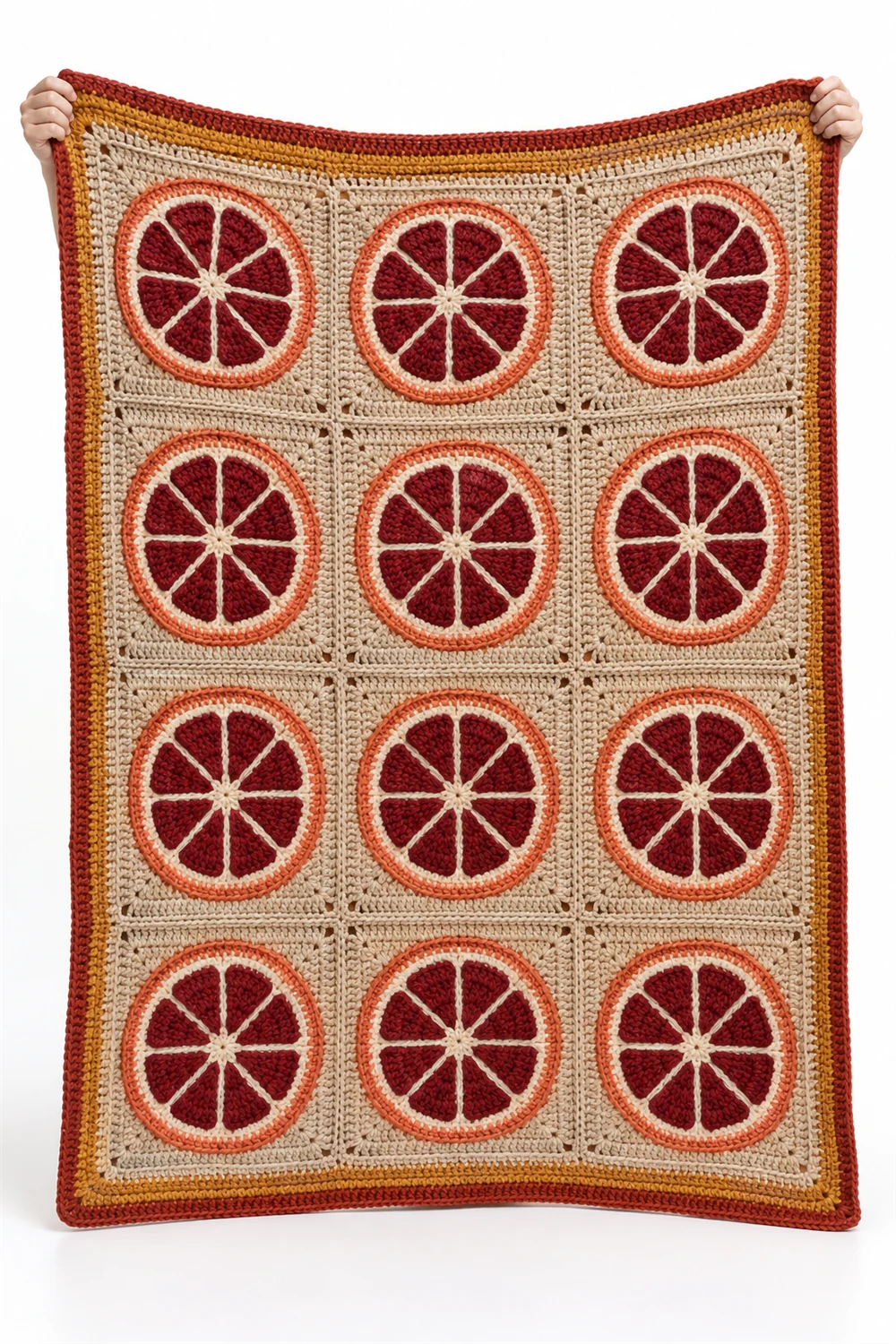
Blood Orange Panel Patchwork Throw
Deep coral-red panels join like segments of a blood orange in this striking patchwork throw. The saturated color is the whole statement — rich, almost edible reds arranged so the seams between panels read like the membranes between citrus segments.
The patchwork logic makes this the most structured concept of the five: distinct panels, clearly joined, each one a solid field of color. That structure is also its practical advantage — panel by panel, a large throw becomes a portable project rather than a lapful of fabric.
For a quieter room, the same segmentation works in tonal versions: five shades of coral from palest blush to deepest rust, arranged like a gradient across the fruit. The blood orange reference survives even in monochrome.
Blue Lime Blossom Tapestry Stripe Throw
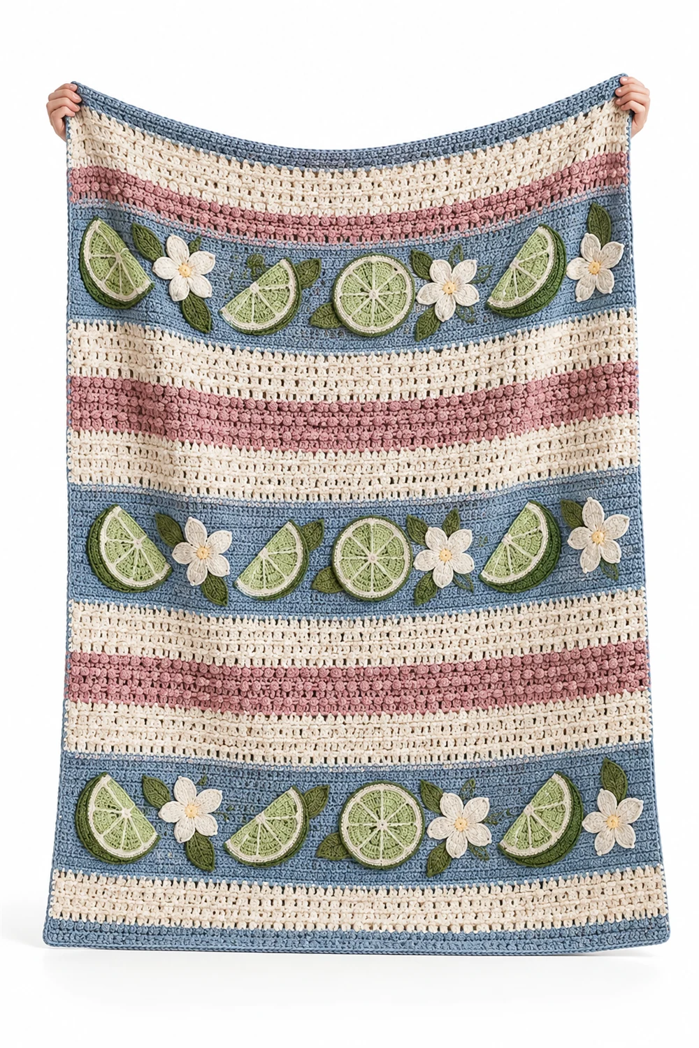
Cool blue stripes bloom with lime blossoms in this tapestry-style throw — a pairing that feels like shade and citrus flower at once. The blue bands provide the cool, the blossom motifs provide the warmth, and the alternation keeps either from dominating.
Stripe-and-motif is a classic blanket rhythm, but the choice of blossom changes its register completely. Geometric motifs would read modern; flowers read romantic. Scattering the blossoms along the stripes rather than lining them up in strict rows gives the throw its tapestry-like, slightly vintage quality.
Color-wise, this concept shows how to cool down a citrus palette without losing it: keep the fruit tones in the details — the blossom centers, a border line — and let blue carry the body. The result suits coastal and garden-facing rooms especially well.
Citron Diagonal Medallion Throw
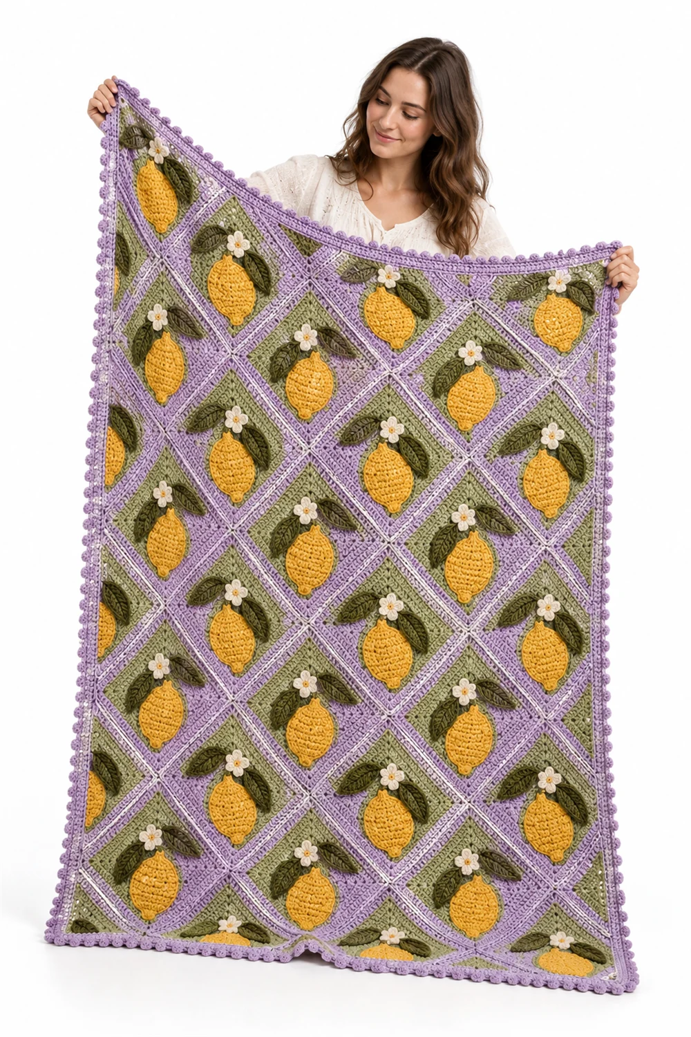
Citron-yellow medallions tilt on the diagonal across this throw, giving a classic motif an unexpected sense of motion. Instead of sitting square and static, each medallion leans — as if the whole blanket were caught in a gentle breeze off the orchard.
The diagonal placement is the design idea worth stealing. Any traditional motif gains energy when rotated off its expected axis, and medallions are particularly good candidates because their symmetry survives the tilt. Against a quiet ground, the yellow shapes read like slices of citron tumbling across the fabric.
Citron yellow is a confident color that wants neutral company: cream, warm grey or pale sage grounds let it shine without shouting. In a minimalist room, this throw would be the single note of saturated color — which is exactly how citrus works in cooking too.
Kumquat Center Motif Throw
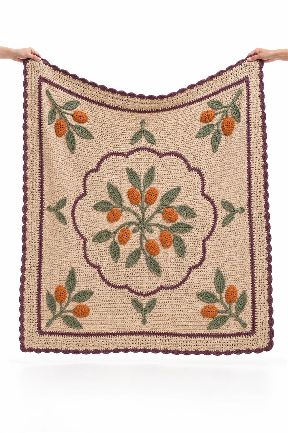
Everything radiates from a single kumquat-orange heart in this center-out throw design. The concentrated burst of warm color at the middle draws the eye immediately, and each round of the design moves outward like ripples from a dropped fruit.
Center-out construction creates a natural focal point, which changes how a throw is used: folded over a sofa arm, the center medallion shows; spread on a bed, it anchors the whole arrangement. The kumquat orange at the core is a small, intense dose of color — proof that a little saturation goes far.
The radiating structure suits gradual color transitions beautifully: orange at the heart softening through peach and apricot toward a cream edge, like the cross-section of the fruit itself. It is the most sculptural of the five concepts — less a pattern, more a sun.
Pomelo Relief Border Throw
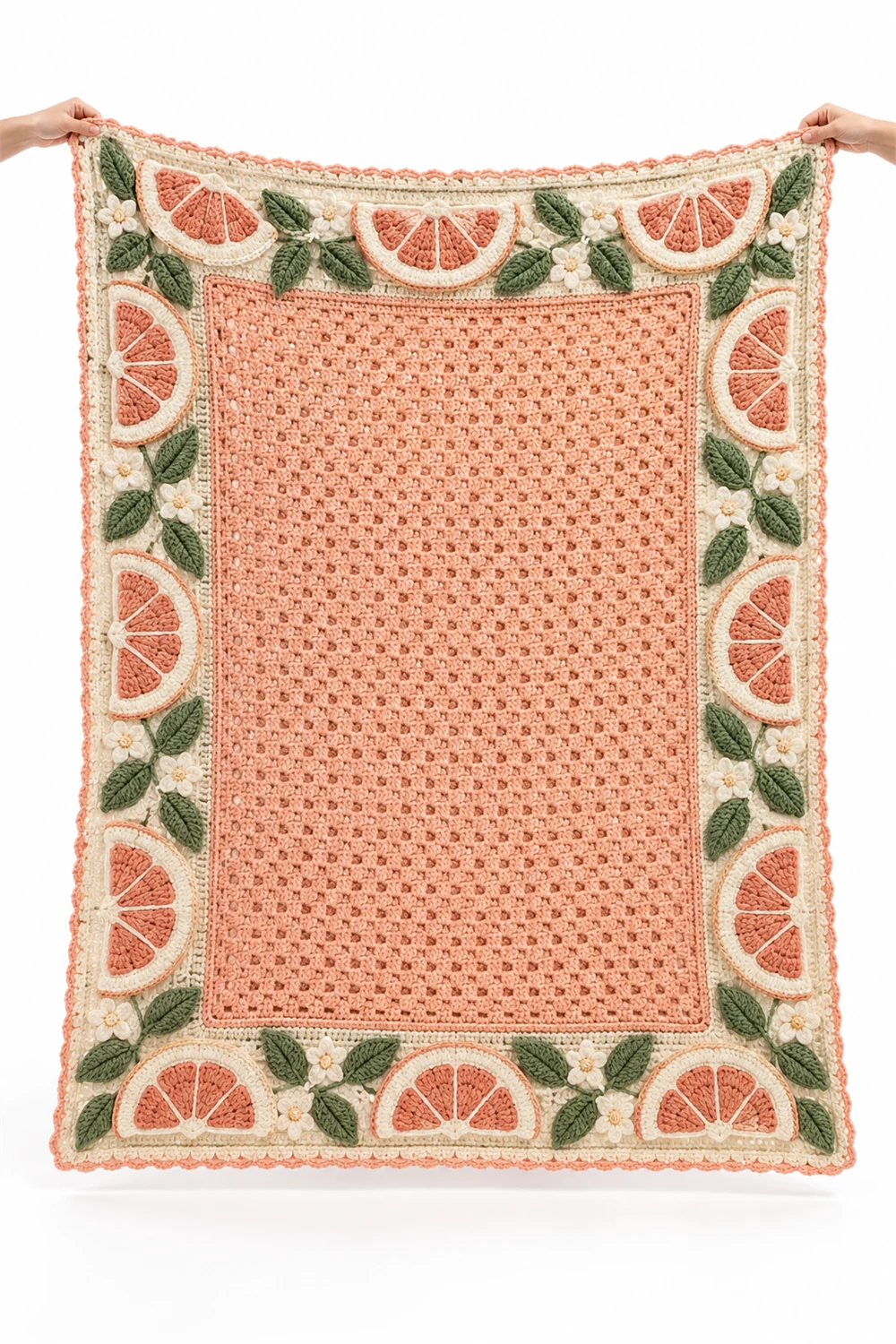
A sculptural relief border in pale pomelo tones frames this throw like peel around fruit flesh. The raised texture at the edges gives the blanket weight and presence, while the quieter center keeps the design from overwhelming the sofa.
The border-as-subject idea flips the usual hierarchy: instead of a decorated middle with a plain edge, here the edge is the decoration. Raised, peel-like texture around the perimeter invites touch and gives the throw a finished, upholstered quality.
Pale pomelo tones — soft yellows, blush pinks, pale greens — make this the gentlest colorway in the collection. It suits nurseries, guest rooms and quiet reading chairs, anywhere a blanket should soothe rather than announce. The drama is in the texture, not the hue.
Picking Your Fruit
Five throws, five ways to squeeze the orchard: the blood orange for drama, the lime blossom for romance, the citron for energy, the kumquat for focus and the pomelo for calm. If you are torn, let the room decide — the throw should be the note of warmth your space is currently missing.
As with every SuperPackCrochet collection, these are AI-generated concept images shared for inspiration — not photographs of finished pieces and not patterns with tested instructions. Take the palette and the construction idea that speak to you, and develop them into something entirely your own.